Dozy Bear Bakery
Logo, Web design, print
- BrandingLogoPackaging & Print
- B2C servicesbaked goodsfarmers market
Custom Logo
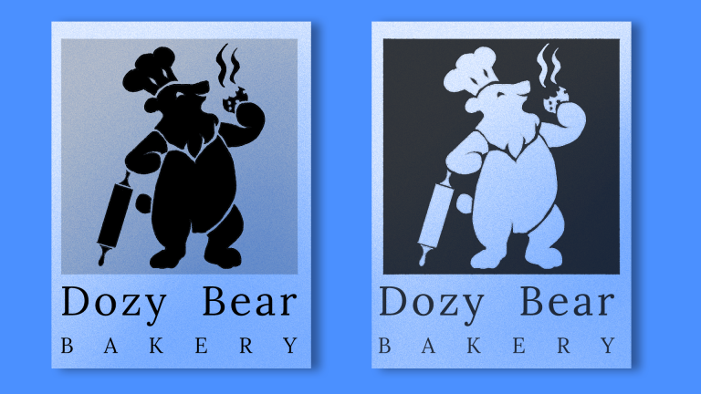
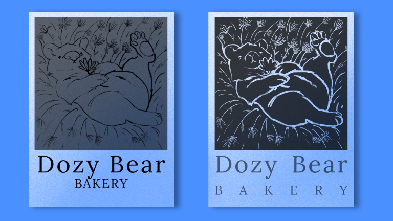
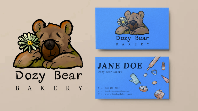
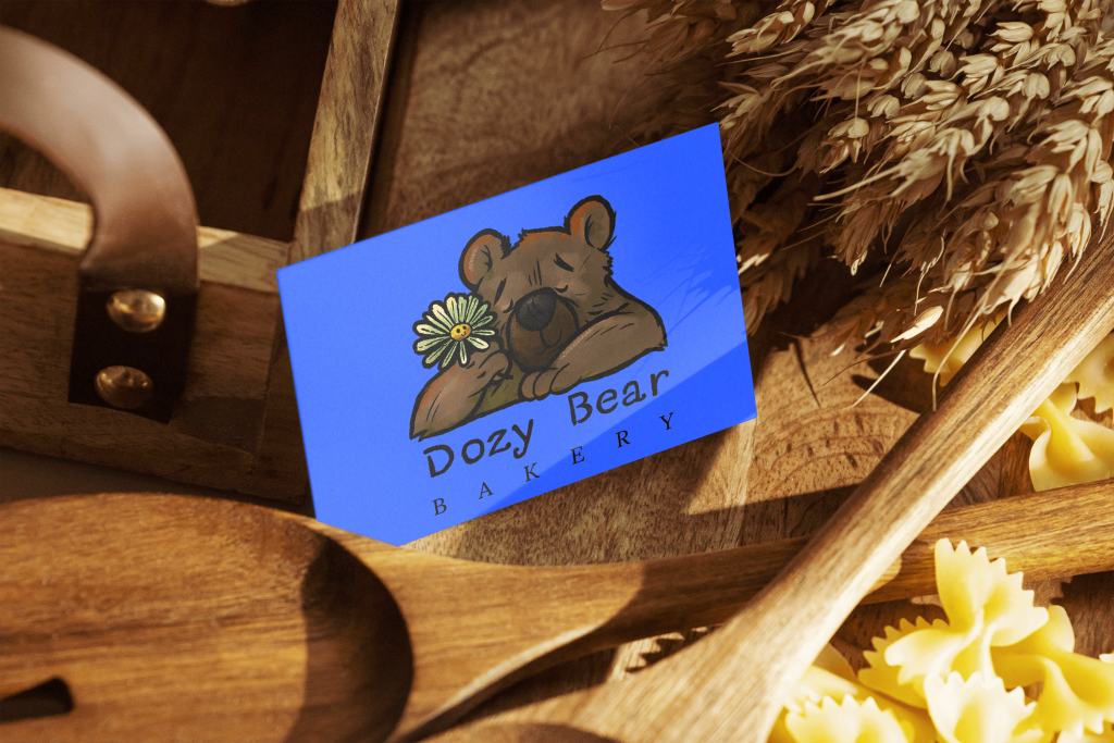
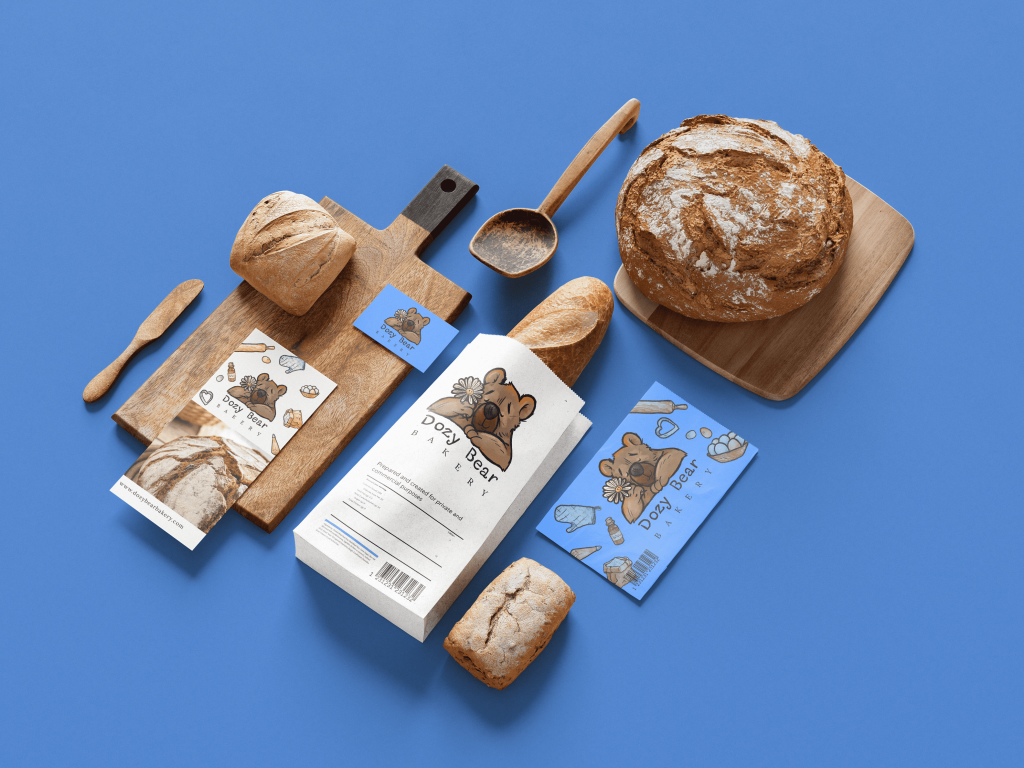
We designed a logo that embodies Dozy Bear Bakery’s cozy, hometown vibe. The centerpiece is a charming bear with a peaceful expression, nestled against a chamomile daisy, evoking a “sleepy time tea” feel. With defined lines for versatile use, the logo is perfect for both colorful packaging and sophisticated silhouette applications. The font’s homemade style adds warmth, while “Bakery” in a contemporary serif brings a touch of modernity.
The Opportunity (Overview)
Dozy Bear Bakery needed a brand that could represent its roots as a local farmers’ market favorite while supporting future growth. The challenge was to create a look that feels personal and inviting, yet polished enough for expansion. Our task was to deliver a brand and visual identity that would resonate with loyal customers and attract new ones, while capturing the essence of their handmade approach.
Branding
For Dozy Bear Bakery, we crafted a brand identity that captures the charm of a local Hudson Valley bakery while leaving room for future growth. The branding features a warm sky-blue palette, reminiscent of open markets and calming chamomile. The handmade, friendly typography reflects the homemade quality of the baked goods, paired with a clean serif for clarity. This thoughtful balance ensures the brand feels approachable and authentic, yet polished enough for expansion.
Our Approach (Strategy)
We took a strategy that combined approachable charm with thoughtful sophistication. By developing a flexible brand identity, versatile packaging, and a logo with a timeless yet handcrafted feel, we provided Dozy Bear Bakery with a foundation for growth. Our approach ensured that the brand could easily adapt to various packaging needs and expand beyond the farmers’ market while still maintaining its homey, local charm.
Packaging & Print
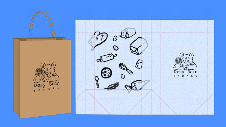
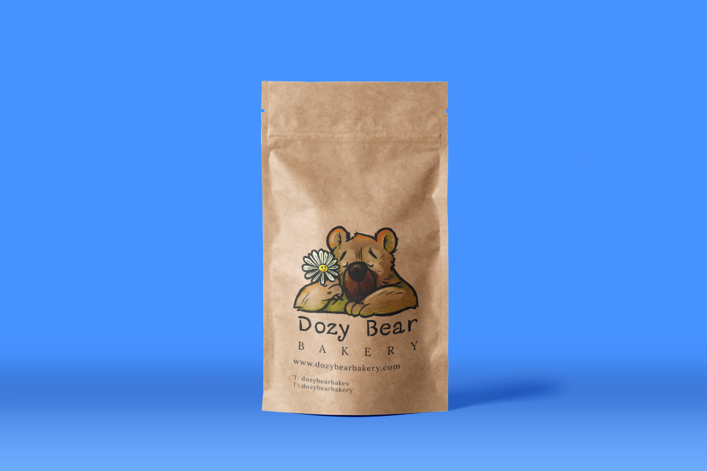
To accommodate the variety of baked goods, we developed flexible packaging options featuring a custom hand-drawn pattern. The watercolor illustrations of baked goods and baking tools create a lively, handcrafted look while maintaining a professional and clean appearance. This approach ensures the packaging feels as homemade as the treats inside, while also conveying the care and quality that go into every batch.
