Saboon Maazeh
Logo, Web design, print
- BrandingLogoWebsite Design & Development
- B2C serviceshomemade goodssoaps

Packaging & Print
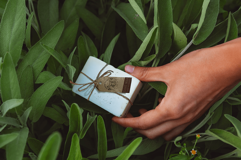
For the packaging, we chose eco-friendly brown paper that was recyclable, perfectly matching the homemade look and sustainable ethos of Saboon Maazeh. The design featured natural textures and minimalist patterns that conveyed an organic feel while still being sophisticated enough for retail expansion. We also created print materials for farmers’ markets and events, ensuring the brand’s personality was consistently reflected.
The Opportunity (Overview)
Saboon Maazeh wanted to grow beyond its small-scale farm-to-soap roots without losing the authentic, handcrafted charm that made it special. The goal was to refresh the brand for a broader audience while staying true to its holistic and sustainable ethos. This required updated branding, eco-friendly packaging, and a modern website that could support e-commerce and share the story behind the products.
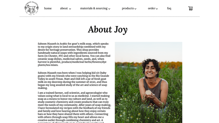
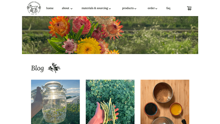
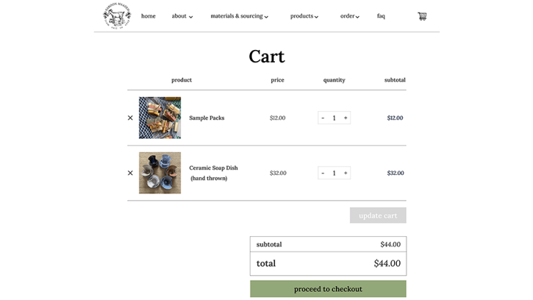
Website
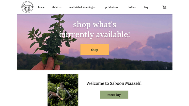
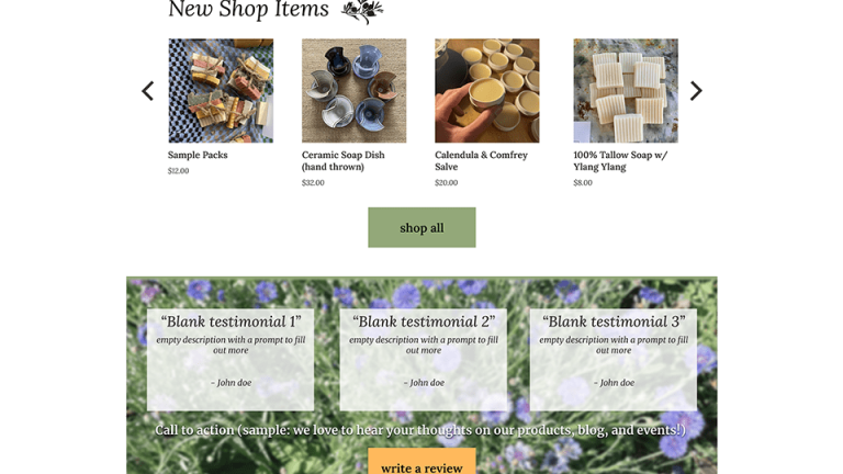
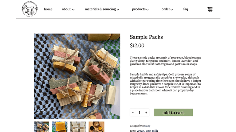
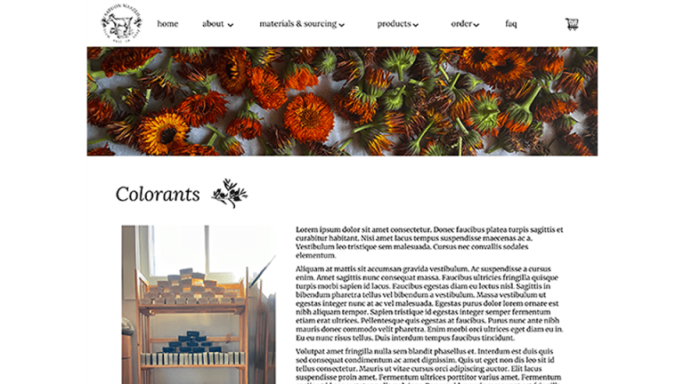
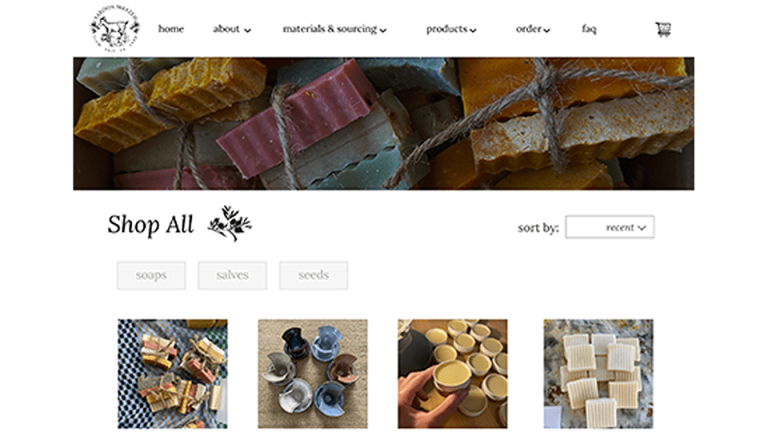
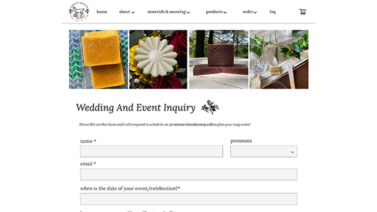
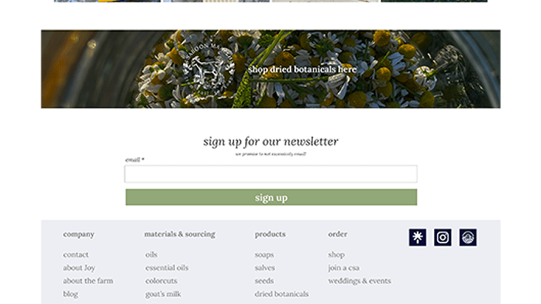
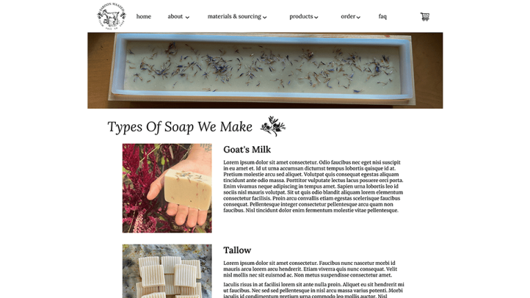
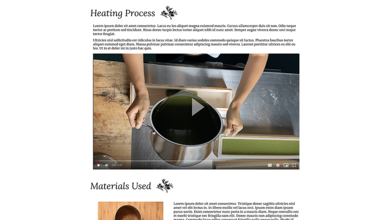
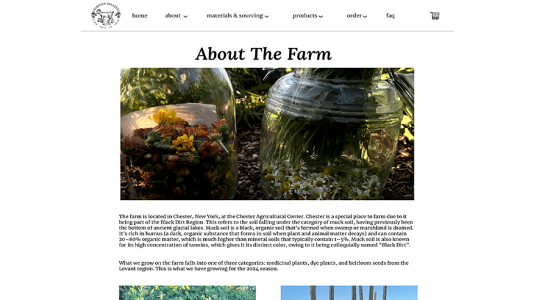
The new website design brought Joy’s vision to life, reflecting her brand’s natural and handcrafted qualities. The site seamlessly guided visitors through Saboon Maazeh’s story, from their soap-making process and farm-grown ingredients to blog updates, events, and a user-friendly e-commerce section. With multiple payment options and an intuitive layout, the website was designed to cater to both new customers and loyal fans who enjoy reading about the art of soap-making.

Our Approach (Strategy)
We took a nature-inspired approach, focusing on earthy tones and a refreshed logo that reflected Saboon Maazeh’s farm-fresh identity. The branding was designed to feel artisanal yet professional, appealing to a wider market without compromising the brand’s authenticity. Packaging was kept sustainable, using recyclable materials that fit the natural aesthetic. For the website, we crafted an intuitive design that combined storytelling with an easy-to-navigate e-commerce experience, making it perfect for both long-time fans and new customers discovering the brand.
Branding
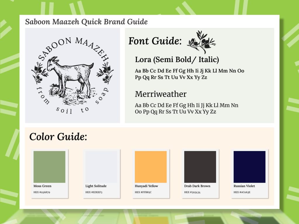
To help Saboon Maazeh expand while preserving its farm-to-soap authenticity, we crafted a branding style with natural green and brown tones, accented by a vibrant yellow for emphasis. We refreshed the logo, updating the fonts for readability and integrating them with the new color palette to create a cohesive, artisanal look that appealed to both Joy’s loyal customers and new audiences.

